Date Chooser: A simple date gui control.
Chen Xiao <chenxiao770117@gmail.com>
1 Introduction
Use gui and draw toolkit to make a date gui control. Only need specify the parent, width, height, you’ll have a date control on the parent ui.
It looks like:
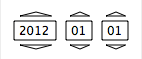
click triangle button to change date.The always is a valid date. For example, if current date is 20120229, click year down button, the date will change to 20110228, because 20110229 is not a valid date, so it will turned to be a valid date below it.
2 API
|
superclass: object% |
method
(send a-date-chooser get-date) → date?
method
(send a-date-chooser set-date new-date) → void?
new-date : date?
constructor
(new date-chooser% [parent-gui parent-gui] [width width] [height height] [ [choosed-date choosed-date] [font font]] [background-color background-color] [text-color text-color] [border-color border-color] [button-down-border-color button-down-border-color] [button-down-fill-color button-down-fill-color] [button-up-border-color button-up-border-color] [button-up-fill-color button-up-fill-color]) → (is-a?/c date-chooser%) parent-gui : (or/c (is-a?/c frame%) (is-a?/c dialog%) (is-a?/c panel%) (is-a?/c pane%)) width : exact-positive-integer? height : exact-positive-integer? choosed-date : date? = (current-date) font : (is-a?/c font%) = (make-object font%) background-color : (or/c string? (is-a?/c color%)) text-color : (or/c string? (is-a?/c color%)) border-color : (or/c string? (is-a?/c color%)) button-down-border-color : (or/c string? (is-a?/c color%)) button-down-fill-color : (or/c string? (is-a?/c color%)) button-up-border-color : (or/c string? (is-a?/c color%)) button-up-fill-color : (or/c string? (is-a?/c color%)) The parent-gui is the container, the date-chooser% is placed in center of it. If date-chooser%’s width or height is larger than the container, so some content will not displayed.The width and height only point out the date-chooser% control will ocuppy how much space.The real size of the control depends on font%.So you need to justify width and height to fit the font%’s size.
The button-...-color used to set button’s effect. Set them if you need.
3 Example
#lang racket |
|
(require (planet "date-chooser.rkt" ("chenxiao" "date-chooser.plt" 1 0))) |
|
(require racket/gui racket/draw racket/date) |
|
(define-values (screen-width screen-height) (get-display-size)) |
|
(define app-width 300) |
|
(define app-height 520) |
|
(define test-frame (new frame% |
[label "DateChooser Example"] |
[width app-width] |
[height app-height] |
[x (- (quotient screen-width 2) (quotient app-width 2))] |
[y (- (quotient screen-height 2) (quotient app-height 2))] |
)) |
(new date-chooser% |
[parent-gui test-frame] |
[width 140] |
[height 60] |
[choosed-date (seconds->date (find-seconds 0 0 0 1 1 2012))]) |
|
(new date-chooser% |
[parent-gui test-frame] |
[width 140] |
[height 60] |
[choosed-date (seconds->date (find-seconds 0 0 0 1 1 2012))] |
[background-color "blue"] |
[text-color "white"]) |
|
(new date-chooser% |
[parent-gui test-frame] |
[width 300] |
[height 100] |
[choosed-date (seconds->date (find-seconds 0 0 0 1 1 2012))] |
[font (make-object font% 30 'default)] |
[background-color"black"] |
[text-color "white"]) |
|
(new date-chooser% |
[parent-gui test-frame] |
[width 300] |
[height 100] |
[choosed-date (seconds->date (find-seconds 0 0 0 1 1 2012))] |
[font (make-object font% 30 'default 'slant 'bold)]) |
|
(new date-chooser% |
[parent-gui test-frame] |
[width 300] |
[height 100] |
[choosed-date (seconds->date (find-seconds 0 0 0 1 1 2012))] |
[font (make-object font% 30 'default)] |
[background-color"black"] |
[text-color "white"] |
[border-color "red"]) |
|
(new date-chooser% |
[parent-gui test-frame] |
[width 300] |
[height 100] |
[choosed-date (seconds->date (find-seconds 0 0 0 1 1 2012))] |
[font (make-object font% 30 'default)] |
[border-color "red"] |
[button-down-border-color "brown"] |
[button-down-fill-color "gold"] |
[button-up-border-color "darkred"] |
[button-up-fill-color "olive"]) |
|
(send test-frame show #t) |
